

Launching Belong's site search so customers could self-serve
Led the design and reshaping of Belong’s Site Search experience.
~154k
searches per year
~7.3k
unique users per month
Role
Product Designer
Team
Product Owner
Product Designer (Me)
Frontend Developers (2)
Design Systems Team (2)
Accessibility Team (2)
Solutions Architect
Tools
Figma
Skills
Product Design
Project Reshaping
Stakeholder Management
WCAG 2.0
Launching Belong's site search so customers could self-serve
Led the design and reshaping of Belong’s Site Search experience.
~154k
searches per year
~7.3k
unique users per month
Role
Product Designer
Team
Product Owner
Product Designer (Me)
Frontend Developers (2)
Design Systems Team (2)
Accessibility Team (2)
Solutions Architect
Tools
Figma
Skills
Product Design
Project Reshaping
Stakeholder Management
WCAG 2.0
Launching Belong's site search so customers could self-serve
Led the design and reshaping of Belong’s Site Search experience.
~154k
searches per year
~7.3k
unique users per month
Role
Product Designer
Team
Product Owner
Product Designer (Me)
Frontend Developers (2)
Design Systems Team (2)
Accessibility Team (2)
Solutions Architect
Tools
Figma
Skills
Product Design
Project Reshaping
Stakeholder Management
WCAG 2.0
Launching Belong's site search so customers could self-serve
Led the design and reshaping of Belong’s Site Search experience.
~154k
searches per year
~7.3k
unique users per month
Role
Product Designer
Team
Product Owner
Product Designer (Me)
Frontend Developers (2)
Design Systems Team (2)
Accessibility Team (2)
Solutions Architect
Tools
Figma
Skills
Product Design
Project Reshaping
Stakeholder Management
WCAG 2.0
MY ROLE
As the Product Designer for Site Search, I...
Led & advocated the design decisions with the product owner to reshape site search to deliver a better, simpler experience.
Worked closely with the design system and accessibility teams to make sure the designs were WCAG 2.0 approved.
Followed a design review process to ensure the project was handed off smoothly to engineers.
MY ROLE
As the Product Designer for Site Search, I...
Led & advocated the design decisions with the product owner to reshape site search to deliver a better, simpler experience.
Worked closely with the design system and accessibility teams to make sure the designs were WCAG 2.0 approved.
Followed a design review process to ensure the project was handed off smoothly to engineers.
MY ROLE
As the Product Designer for Site Search, I...
Led & advocated the design decisions with the product owner to reshape site search to deliver a better, simpler experience.
Worked closely with the design system and accessibility teams to make sure the designs were WCAG 2.0 approved.
Followed a design review process to ensure the project was handed off smoothly to engineers.
PROBLEM
Visitors had no way to search for information on Belong's website
When visitors or Belong customers needed help with a service or product, they were often pushed toward our live chat or call centre channels to find help as our support hub was quite hard to navigate. This led to unnecessary costs for the business and added friction and complexity to customer service by making customers use our chatbot or call up.
PROBLEM
Visitors had no way to search for information on Belong's website
When visitors or Belong customers needed help with a service or product, they were often pushed toward our live chat or call centre channels to find help as our support hub was quite hard to navigate. This led to unnecessary costs for the business and added friction and complexity to customer service by making customers use our chatbot or call up.
PROBLEM
Visitors had no way to search for information on Belong's website
When visitors or Belong customers needed help with a service or product, they were often pushed toward our live chat or call centre channels to find help as our support hub was quite hard to navigate. This led to unnecessary costs for the business and added friction and complexity to customer service by making customers use our chatbot or call up.
SOLUTION PREVIEW
A simple, easy-to-use global site search
Built simple, easy-to-use site search functionality that let users enter a keyword and get results for it
Search Belong
Belong Site Search Demo
Try searching in the field above!
Search experience
Search results
SOLUTION PREVIEW
A simple, easy-to-use global site search
Built simple, easy-to-use site search functionality that let users enter a keyword and get results for it
Search Belong
Belong Site Search Demo
Try searching in the field above!
Search experience
Search results
SOLUTION PREVIEW
A simple, easy-to-use global site search
Built simple, easy-to-use site search functionality that let users enter a keyword and get results for it
Search Belong
Belong Site Search Demo
Try searching in the field above!
Search experience
Search results
PROJECT REQUIREMENTS
Agreeing the baseline: type a keyword, hit search, get results
NOTE: I joined this project after the UX research was done, and midway through the designs taking shape.
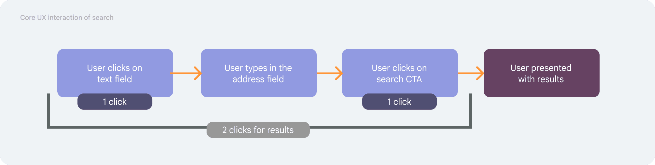
Before assessing any of the designs of this project, my first goal was to get an understanding of what the core interaction of search was meant to be. After discussing this with the stakeholders, the core principle of site search was the following:
User clicks on search - user types keyword - hits search CTA - presented with the results
PROJECT REQUIREMENTS
Agreeing the baseline: type a keyword, hit search, get results
NOTE: I joined this project after the UX research was done, and midway through the designs taking shape.
Before assessing any of the designs of this project, my first goal was to get an understanding of what the core interaction of search was meant to be. After discussing this with the stakeholders, the core principle of site search was the following:
User clicks on search - user types keyword - hits search CTA - presented with the results
PROJECT REQUIREMENTS
Agreeing the baseline: type a keyword, hit search, get results
NOTE: I joined this project after the UX research was done, and midway through the designs taking shape.
Before assessing any of the designs of this project, my first goal was to get an understanding of what the core interaction of search was meant to be. After discussing this with the stakeholders, the core principle of site search was the following:
User clicks on search - user types keyword - hits search CTA - presented with the results
RESHAPING THE EXPERIENCE
The proposed journey had more features than the baseline needed
When I went through the proposed journey, it was clear that the main idea of search was there but there were too many proposed features that were making the experience and scope more complex than it needed to be.
While these features are quite common search features, for us these were 1) nice-to-have features or 2) features with that didn't match the baseline; and if built, wouldn't add any UX value.
RESHAPING THE EXPERIENCE
The proposed journey had more features than the baseline needed
When I went through the proposed journey, it was clear that the main idea of search was there but there were too many proposed features that were making the experience and scope more complex than it needed to be.
While these features are quite common search features, for us these were 1) nice-to-have features or 2) features with that didn't match the baseline; and if built, wouldn't add any UX value.
RESHAPING THE EXPERIENCE
The proposed journey had more features than the baseline needed
When I went through the proposed journey, it was clear that the main idea of search was there but there were too many proposed features that were making the experience and scope more complex than it needed to be.
While these features are quite common search features, for us these were 1) nice-to-have features or 2) features with that didn't match the baseline; and if built, wouldn't add any UX value.
DESIGN DECISIONS
Cutting four "standard" search features to protect the baseline
After identifying the UX impact of these features and discussing with stakeholders, we agreed the main design of this project would be a simple search field, with a CTA, once clicked, provides results.
This meant we made the decision to remove: live results, autofill, filters & popular terms (deferred).
Live results

Removed as this did not fit in with our baseline UX flow, and added a lot of build complexity. The value in UX was not justified either.
Autofill

While this was a standard feature among many search bars, we decided based on our baseline that it was adding unnecessary build complexity.
Filters

After reviewing how much content we had and how Typesense worked (the software powering our search), and how it provides results on relevancy. The conclusion was that users would most likely find what they were looking for in the 10 results.
Popular searches

This feature wasn’t exactly removed but was put in a future release once we'd learnt what users are searching for.
DESIGN DECISIONS
Cutting four "standard" search features to protect the baseline
After identifying the UX impact of these features and discussing with stakeholders, we agreed the main design of this project would be a simple search field, with a CTA, once clicked, provides results.
This meant we made the decision to remove: live results, autofill, filters & popular terms (deferred).
Live results
Removed as this did not fit in with our baseline UX flow, and added a lot of build complexity. The value in UX was not justified either.
Autofill
While this was a standard feature among many search bars, we decided based on our baseline that it was adding unnecessary build complexity.
Filters
After reviewing how much content we had and how Typesense worked (the software powering our search), and how it provides results on relevancy. The conclusion was that users would most likely find what they were looking for in the 10 results.
Popular searches
This feature wasn’t exactly removed but was put in a future release once we'd learnt what users are searching for.
DESIGN DECISIONS
Cutting four "standard" search features to protect the baseline
After identifying the UX impact of these features and discussing with stakeholders, we agreed the main design of this project would be a simple search field, with a CTA, once clicked, provides results.
This meant we made the decision to remove: live results, autofill, filters & popular terms (deferred).
Live results
Removed as this did not fit in with our baseline UX flow, and added a lot of build complexity. The value in UX was not justified either.
Autofill
While this was a standard feature among many search bars, we decided based on our baseline that it was adding unnecessary build complexity.
Filters
After reviewing how much content we had and how Typesense worked (the software powering our search), and how it provides results on relevancy. The conclusion was that users would most likely find what they were looking for in the 10 results.
Popular searches
This feature wasn’t exactly removed but was put in a future release once we'd learnt what users are searching for.
ACCESSIBILITY
"See more results" instead of pagination, so results never disappear
When it came to accessibility, the main concern was around results and new results. On keyword search, we needed the title to say how many results were found for the entered keyword e.g., 200 search results for ‘nbn’ followed by ‘Results X to X’ and the result links. Semantically, this made sense as this meant each result section was a child of ‘XXX search results for "keyword"’.

When I assessed the designs, the proposed pagination was the traditional ‘1 of X’ pagination pattern.
In consultation with the accessibility & design system team, this was deemed not the best experience. When a user selects a new page, their mobile's viewport would reset to the top of the page showing the new load of results. This also meant users had to swap in and out of pages to see past results, as they were no longer present on the page to view.
We decided to go with a ‘See more results’ CTA instead that would load more results underneath the last result displayed. Doing this allowed the results to always stay on the current page and did not require users to go back. When new results loaded the focus had to be on the new ‘Results X to X’ for this to be WCAG 2.0 approved.

Traditional pagination
See more results

ACCESSIBILITY
"See more results" instead of pagination, so results never disappear
When it came to accessibility, the main concern was around results and new results. On keyword search, we needed the title to say how many results were found for the entered keyword e.g., 200 search results for ‘nbn’ followed by ‘Results X to X’ and the result links. Semantically, this made sense as this meant each result section was a child of ‘XXX search results for "keyword"’.
When I assessed the designs, the proposed pagination was the traditional ‘1 of X’ pagination pattern.
In consultation with the accessibility & design system team, this was deemed not the best experience. When a user selects a new page, their mobile's viewport would reset to the top of the page showing the new load of results. This also meant users had to swap in and out of pages to see past results, as they were no longer present on the page to view.
We decided to go with a ‘See more results’ CTA instead that would load more results underneath the last result displayed. Doing this allowed the results to always stay on the current page and did not require users to go back. When new results loaded the focus had to be on the new ‘Results X to X’ for this to be WCAG 2.0 approved.
Traditional pagination
See more results
ACCESSIBILITY
"See more results" instead of pagination, so results never disappear
When it came to accessibility, the main concern was around results and new results. On keyword search, we needed the title to say how many results were found for the entered keyword e.g., 200 search results for ‘nbn’ followed by ‘Results X to X’ and the result links. Semantically, this made sense as this meant each result section was a child of ‘XXX search results for "keyword"’.
When I assessed the designs, the proposed pagination was the traditional ‘1 of X’ pagination pattern.
In consultation with the accessibility & design system team, this was deemed not the best experience. When a user selects a new page, their mobile's viewport would reset to the top of the page showing the new load of results. This also meant users had to swap in and out of pages to see past results, as they were no longer present on the page to view.
We decided to go with a ‘See more results’ CTA instead that would load more results underneath the last result displayed. Doing this allowed the results to always stay on the current page and did not require users to go back. When new results loaded the focus had to be on the new ‘Results X to X’ for this to be WCAG 2.0 approved.
Traditional pagination
See more results
OUTCOMES
2,000 eSIM searches in week one; ~154k a year since
A simple search experience that saw over 2000 searches for eSIM in the first week. Since launch, it has ~154k searches per year and ~7.3k unique users per month.
OUTCOMES
2,000 eSIM searches in week one; ~154k a year since
A simple search experience that saw over 2000 searches for eSIM in the first week. Since launch, it has ~154k searches per year and ~7.3k unique users per month.
OUTCOMES
2,000 eSIM searches in week one; ~154k a year since
A simple search experience that saw over 2000 searches for eSIM in the first week. Since launch, it has ~154k searches per year and ~7.3k unique users per month.