

Belong's new internet sign-up experience
Led the redesign of Belong’s internet ordering flow into an accessible, single-page experience, lifting conversion from 3.6% to 5.4% in the first week.
50%
increase in conversion (WoW)
2%+
increase in address completion success
Role
Product Designer
Team
Product Owner
Product Designer (Me)
Frontend Developers (2)
Accessibility Team (2)
Design System Team (2)
Tools
Figma
Skills
Product Design
End-to-end mapping
0-1 Design
WCAG 2.0
Belong's new internet sign-up experience
Led the redesign of Belong’s internet ordering flow into an accessible, single-page experience, lifting conversion from 3.6% to 5.4% in the first week.
50%
increase in conversion (WoW)
2%+
increase in address completion success
Role
Product Designer
Team
Product Owner
Product Designer (Me)
Frontend Developers (2)
Accessibility Team (2)
Design System Team (2)
Tools
Figma
Skills
Product Design
End-to-end mapping
0-1 Design
WCAG 2.0
Belong's new internet sign-up experience
Led the redesign of Belong’s internet ordering flow into an accessible, single-page experience, lifting conversion from 3.6% to 5.4% in the first week.
50%
increase in conversion (WoW)
2%+
increase in address completion success
Role
Product Designer
Team
Product Owner
Product Designer (Me)
Frontend Developers (2)
Accessibility Team (2)
Design System Team (2)
Tools
Figma
Skills
Product Design
End-to-end mapping
0-1 Design
WCAG 2.0
MY ROLE
As the Product Designer for Belong's new nbn experience, I...
Mapped out the entire nbn ordering flow experience to identify friction & areas we could improve the UX
Delivered a new component and a single-page flow instead of a multi-step one
Worked closely with the design system and accessibility team to hit WCAG 2.0 AA approval
Followed a design review process to ensure the project was handed off smoothly
MY ROLE
As the Product Designer for Belong's new nbn experience, I...
Mapped out the entire nbn ordering flow experience to identify friction & areas we could improve the UX
Delivered a new component and a single-page flow instead of a multi-step one
Worked closely with the design system and accessibility team to hit WCAG 2.0 AA approval
Followed a design review process to ensure the project was handed off smoothly
MY ROLE
As the Product Designer for Belong's new nbn experience, I...
Mapped out the entire nbn ordering flow experience to identify friction & areas we could improve the UX
Delivered a new component and a single-page flow instead of a multi-step one
Worked closely with the design system and accessibility team to hit WCAG 2.0 AA approval
Followed a design review process to ensure the project was handed off smoothly
PROBLEM
A disjointed sign-up experience hurting conversion
Our nbn sign-up experience had a disconnected ordering journey, an outdated address check, unnecessary pages for certain steps, and accessibility issues. This caused friction for customers signing up to our nbn and hindered sales.
PROBLEM
A disjointed sign-up experience hurting conversion
Our nbn sign-up experience had a disconnected ordering journey, an outdated address check, unnecessary pages for certain steps, and accessibility issues. This caused friction for customers signing up to our nbn and hindered sales.
PROBLEM
A disjointed sign-up experience hurting conversion
Our nbn sign-up experience had a disconnected ordering journey, an outdated address check, unnecessary pages for certain steps, and accessibility issues. This caused friction for customers signing up to our nbn and hindered sales.
SOLUTION PREVIEW
From a multi-page experience to a seamless one-page sign-up
The solution consolidated the multi-page journey into one accessible ordering experience, with a redesigned address check and a simpler flow that helped customers move from eligibility to sign-up with less friction.

New sign-up experience
Before & after of address check experience
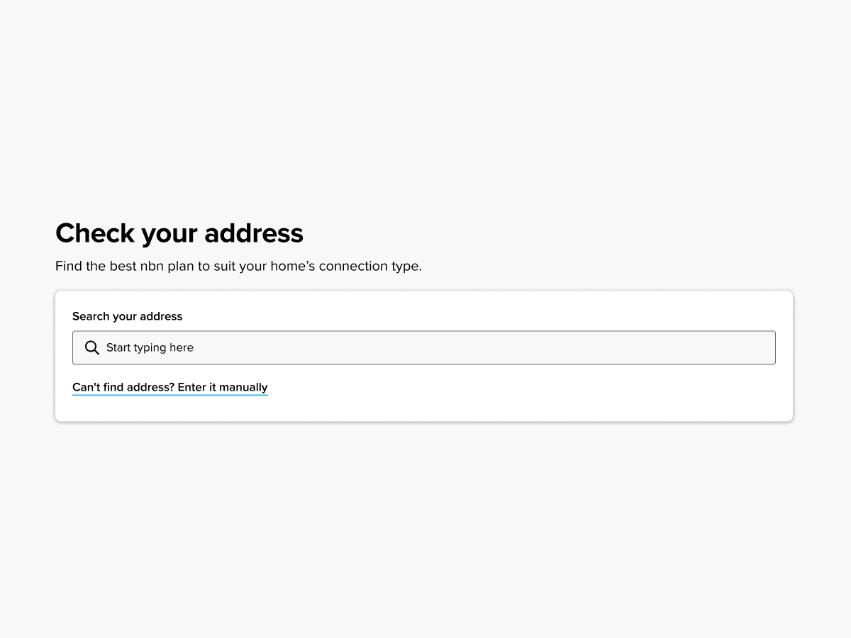

Information callouts
SOLUTION PREVIEW
From a multi-page experience to a seamless one-page sign-up
The solution consolidated the multi-page journey into one accessible ordering experience, with a redesigned address check and a simpler flow that helped customers move from eligibility to sign-up with less friction.
New sign-up experience
Before & after of address check experience
Information callouts
SOLUTION PREVIEW
From a multi-page experience to a seamless one-page sign-up
The solution consolidated the multi-page journey into one accessible ordering experience, with a redesigned address check and a simpler flow that helped customers move from eligibility to sign-up with less friction.
New sign-up experience
Before & after of address check experience
Information callouts
UNDERSTAND THE CORE FLOW
Mapping the flow exposed two pages doing the same job
To understand what the pain points customers were facing, I mapped out our current end-to-end nbn ordering experience from doing your address eligibility and picking a plan, all the way to placing an order.

Simplifying the experience
When I mapped out the flow, it was identified that doing simple tasks within the “checkout flow", like picking a plan or changing address, required too many clicks.
Within the ‘checkout flow’ there were 2 pages we called the pre-sq (service qualification) and post-sq. This is where customers were facing the most friction in our sign up journey.
The main issue in this flow was users saw content on the pre-sq page, then it was repeated on the post-sq page with minimal changes i.e., seeing the plan cards twice with different CTAs. On the post-sq page is where they saw their eligibility & any additional info, this was displayed poorly and even stated in user research as ‘sneaky’.
If users wanted to change their address on the post-sq page, they were required to go to another page. From there they could change their address but would end up back on the post-sq page after they had changed their address.
The proposed flow was to consolidate everything that you needed to do for internet sign up, which took customers across multiple pages to be completed onto one page instead.
The main component that drives users from the pre-to-post-sq pages was the ‘address checker’ component. This meant we had to look at how we could improve our current component and allow it to have better functionality.

UNDERSTAND THE CORE FLOW
Mapping the flow exposed two pages doing the same job
To understand what the pain points customers were facing, I mapped out our current end-to-end nbn ordering experience from doing your address eligibility and picking a plan, all the way to placing an order.
Simplifying the experience
When I mapped out the flow, it was identified that doing simple tasks within the “checkout flow", like picking a plan or changing address, required too many clicks.
Within the ‘checkout flow’ there were 2 pages we called the pre-sq (service qualification) and post-sq. This is where customers were facing the most friction in our sign up journey.
The main issue in this flow was users saw content on the pre-sq page, then it was repeated on the post-sq page with minimal changes i.e., seeing the plan cards twice with different CTAs. On the post-sq page is where they saw their eligibility & any additional info, this was displayed poorly and even stated in user research as ‘sneaky’.
If users wanted to change their address on the post-sq page, they were required to go to another page. From there they could change their address but would end up back on the post-sq page after they had changed their address.
The proposed flow was to consolidate everything that you needed to do for internet sign up, which took customers across multiple pages to be completed onto one page instead.
The main component that drives users from the pre-to-post-sq pages was the ‘address checker’ component. This meant we had to look at how we could improve our current component and allow it to have better functionality.
UNDERSTAND THE CORE FLOW
Mapping the flow exposed two pages doing the same job
To understand what the pain points customers were facing, I mapped out our current end-to-end nbn ordering experience from doing your address eligibility and picking a plan, all the way to placing an order.
Simplifying the experience
When I mapped out the flow, it was identified that doing simple tasks within the “checkout flow", like picking a plan or changing address, required too many clicks.
Within the ‘checkout flow’ there were 2 pages we called the pre-sq (service qualification) and post-sq. This is where customers were facing the most friction in our sign up journey.
The main issue in this flow was users saw content on the pre-sq page, then it was repeated on the post-sq page with minimal changes i.e., seeing the plan cards twice with different CTAs. On the post-sq page is where they saw their eligibility & any additional info, this was displayed poorly and even stated in user research as ‘sneaky’.
If users wanted to change their address on the post-sq page, they were required to go to another page. From there they could change their address but would end up back on the post-sq page after they had changed their address.
The proposed flow was to consolidate everything that you needed to do for internet sign up, which took customers across multiple pages to be completed onto one page instead.
The main component that drives users from the pre-to-post-sq pages was the ‘address checker’ component. This meant we had to look at how we could improve our current component and allow it to have better functionality.
USER NEEDS
Customers had two questions: can I get internet, and are there fees?
The address check component was the main driving force that allows users to go from the pre-sq page to the post-sq page. To design the best experience possible I needed to understand what users needed and required from the component. Based on user research from previous nbn projects, there were a few main things that customers wanted to know when checking their address:
Can my address get internet?
Are there any fees?
Along with these main points there was additional information that users raised during user research and they were:
What is my connection type?
Can I get fibre?
Additionally, due to legal compliance we had to show a Maximum Attainable Speed (MAS) alert to a certain cohort of users.
When you compare the information related to these questions and insights from user research, it was clear that the primary information was a 'result message' and the address linked to the result. Any additional information was secondary.

USER NEEDS
Customers had two questions: can I get internet, and are there fees?
The address check component was the main driving force that allows users to go from the pre-sq page to the post-sq page. To design the best experience possible I needed to understand what users needed and required from the component. Based on user research from previous nbn projects, there were a few main things that customers wanted to know when checking their address:
Can my address get internet?
Are there any fees?
Along with these main points there was additional information that users raised during user research and they were:
What is my connection type?
Can I get fibre?
Additionally, due to legal compliance we had to show a Maximum Attainable Speed (MAS) alert to a certain cohort of users.
When you compare the information related to these questions and insights from user research, it was clear that the primary information was a 'result message' and the address linked to the result. Any additional information was secondary.
USER NEEDS
Customers had two questions: can I get internet, and are there fees?
The address check component was the main driving force that allows users to go from the pre-sq page to the post-sq page. To design the best experience possible I needed to understand what users needed and required from the component. Based on user research from previous nbn projects, there were a few main things that customers wanted to know when checking their address:
Can my address get internet?
Are there any fees?
Along with these main points there was additional information that users raised during user research and they were:
What is my connection type?
Can I get fibre?
Additionally, due to legal compliance we had to show a Maximum Attainable Speed (MAS) alert to a certain cohort of users.
When you compare the information related to these questions and insights from user research, it was clear that the primary information was a 'result message' and the address linked to the result. Any additional information was secondary.
COMPETITOR RESEARCH
Compared to the market ours was too complex
One of the main things for the new address check is that we wanted a simplified experience comfirmed that you’re eligible for internet, but also if you had anything affecting the potential connection at your address.
While ours does display if you’re eligible it doesn’t do it effectively due to the fact you got taken to another page and the results were poorly displayed.
From previous user research we knew this caused friction because customers didn't even realise they got a confirmation or they thought they got taken elsewhere.
When compared to the market our experience was quite different to others as their users could get their results on the same page.

COMPETITOR RESEARCH
Compared to the market ours was too complex
One of the main things for the new address check is that we wanted a simplified experience comfirmed that you’re eligible for internet, but also if you had anything affecting the potential connection at your address.
While ours does display if you’re eligible it doesn’t do it effectively due to the fact you got taken to another page and the results were poorly displayed.
From previous user research we knew this caused friction because customers didn't even realise they got a confirmation or they thought they got taken elsewhere.
When compared to the market our experience was quite different to others as their users could get their results on the same page.
COMPETITOR RESEARCH
Compared to the market ours was too complex
One of the main things for the new address check is that we wanted a simplified experience comfirmed that you’re eligible for internet, but also if you had anything affecting the potential connection at your address.
While ours does display if you’re eligible it doesn’t do it effectively due to the fact you got taken to another page and the results were poorly displayed.
From previous user research we knew this caused friction because customers didn't even realise they got a confirmation or they thought they got taken elsewhere.
When compared to the market our experience was quite different to others as their users could get their results on the same page.
DESIGN DECISIONS
Button or no button?
One of the key changes in simplifying the experience was deciding if we need a search button or not.
After consulting with the accessibility team, we decided we didn't need one: in the context of an address search for internet eligibility, the expected behaviour is that clicking an address from the dropdown fires the search.
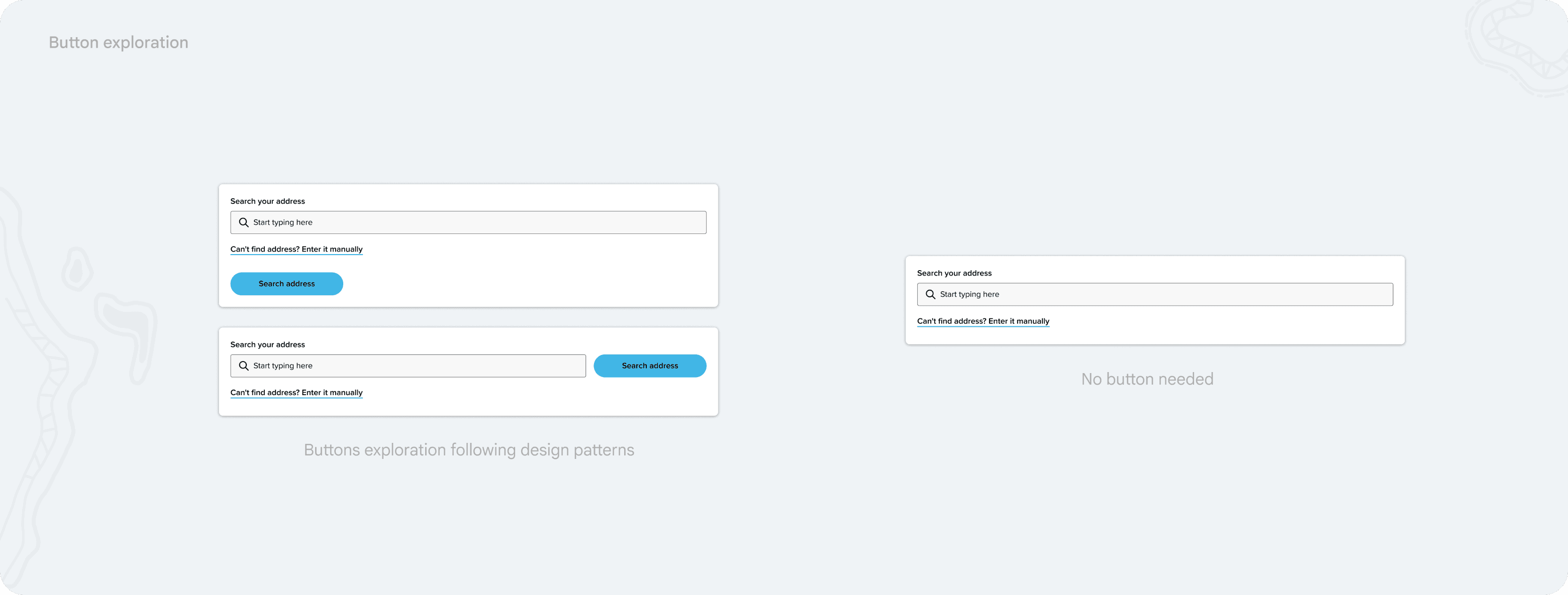
The nbn page had one job: check your address, pick a plan
A key part of making the experience simpler was understanding the intent of the nbn page.
The core intent of a customer visiting the nbn page was to check what plans were available to their address. So with that we decided that checking their address and plan availability was the primary actions to do on this page, and anything else required was secondary and done on another page.
This allowed users to just focus on checking their address, and selecting a plan.
DESIGN DECISIONS
Button or no button?
One of the key changes in simplifying the experience was deciding if we need a search button or not.
After consulting with the accessibility team, we decided we didn't need one: in the context of an address search for internet eligibility, the expected behaviour is that clicking an address from the dropdown fires the search.
The nbn page had one job: check your address, pick a plan
A key part of making the experience simpler was understanding the intent of the nbn page.
The core intent of a customer visiting the nbn page was to check what plans were available to their address. So with that we decided that checking their address and plan availability was the primary actions to do on this page, and anything else required was secondary and done on another page.
This allowed users to just focus on checking their address, and selecting a plan.
DESIGN DECISIONS
Button or no button?
One of the key changes in simplifying the experience was deciding if we need a search button or not.
After consulting with the accessibility team, we decided we didn't need one: in the context of an address search for internet eligibility, the expected behaviour is that clicking an address from the dropdown fires the search.
The nbn page had one job: check your address, pick a plan
A key part of making the experience simpler was understanding the intent of the nbn page.
The core intent of a customer visiting the nbn page was to check what plans were available to their address. So with that we decided that checking their address and plan availability was the primary actions to do on this page, and anything else required was secondary and done on another page.
This allowed users to just focus on checking their address, and selecting a plan.
ACCESSIBILITY
Semantics, solved by design
One of the major accessibility issues with our current design was that it had a lot of semantic issues with headings. In our current experience, we had an H2 sitting inside a card, which not only was an issue for accessibility but went against our design patterns of treating floating components as sections of the page.
Having the H2 outside the address check component meant that we could solve the overall semantic issue on our nbn page and have the sections flow. Visually this meant you could tell the address check field was a child of the H2.

ACCESSIBILITY
Semantics, solved by design
One of the major accessibility issues with our current design was that it had a lot of semantic issues with headings. In our current experience, we had an H2 sitting inside a card, which not only was an issue for accessibility but went against our design patterns of treating floating components as sections of the page.
Having the H2 outside the address check component meant that we could solve the overall semantic issue on our nbn page and have the sections flow. Visually this meant you could tell the address check field was a child of the H2.
ACCESSIBILITY
Semantics, solved by design
One of the major accessibility issues with our current design was that it had a lot of semantic issues with headings. In our current experience, we had an H2 sitting inside a card, which not only was an issue for accessibility but went against our design patterns of treating floating components as sections of the page.
Having the H2 outside the address check component meant that we could solve the overall semantic issue on our nbn page and have the sections flow. Visually this meant you could tell the address check field was a child of the H2.
OUTCOME
Two pages removed, conversion up 50% in the first week
We launched a new simplified experience that removed 2 pages that users had to go through. The new single page experience and new uplifted address checker component increased our conversion by 50% (3.6% to 5.4%) compared to the week prior.
Simple page nbn experience
OUTCOME
Two pages removed, conversion up 50% in the first week
We launched a new simplified experience that removed 2 pages that users had to go through. The new single page experience and new uplifted address checker component increased our conversion by 50% (3.6% to 5.4%) compared to the week prior.
Simple page nbn experience
OUTCOME
Two pages removed, conversion up 50% in the first week
We launched a new simplified experience that removed 2 pages that users had to go through. The new single page experience and new uplifted address checker component increased our conversion by 50% (3.6% to 5.4%) compared to the week prior.
Simple page nbn experience